The Cross Pathway Brief!

Pigeons:
  • Graphic Design [Manager] - Nicola
  • Illustration [Secretary] - James
  • Moving Image - Elizabeth
  • Graphic Design - Jay
This link below is the Blog for our group and everything to do with research, process & Development and also the time management.
Pigeons Blog

We created a six minuet animation in After Effects and also used photoshop and illustration.
It has an element of Stop Frame animation, Green screening.
The animated rooms represent a variety of physical and spiritual choices that we make through life.

Each room is something personal to each member of the group;
Room one : Jay - childhood
Room two: Liz - Teen
Room three: Nic - Early adulthood
Room four: James - Adulthood


The title sequence brief.


also there are bumpers and ending credits.

Brothers Quay

A few examples of stop motion, using a doll.
Stille Nacht I Dramolet 1988 - Quay Brothers


Brothers Quay - Short Films
(Courts métrages Frères Quay)
Quay brothers

England - 1985/93 - 1h05


Stille Nacht I (88),
Stille Nacht II (91),
Stille Nacht III (92),
Stille Nacht IV (93),
Street of crocodiles (85),
Rehearsals for Extinct Anatomies(87),
The Comb (90).


Testing green screen

Testing the lighting and positioning of the dolls, screen, lights etc.


Green screen

The green screening process of part of my title sequence, testing out the timing of the movement
obviously stop frame animation


Also a Still image of the other doll I used on green screen

Part of Mark snow - leap of faith - track 20

I used this track for the main titles, ending credits and the bumpers.
Mark Snow composed the theme tune to the TV series of ghost whisperer.


Ghosts on film

I saw this after Derren Brown tweeted a link to it on his blog, (Ah! I know shameful, I'm on twitter) I thought it was a neat trick. Might use it later in life.


Science Of Scams Dot Com
- click the link to go view the official website.

Science of Scams are another form of webisodes, created by Derren Brown.
Derren and the team released 7 hoax videos which appear to be paranormal phenomena on youtube.
Science of Scams is a series that exposes the secrets behind those 7 hoaxes and how they were created. The video above is webisode number 2 called 'Ghosts on film'.

"Derren and his team have released 7 hoax videos which appear to be paranormal phenomena. In fact they’re all based upon real scientific principles and there’s nothing paranormal about them at all. Over the past few months that hoax footage has been posted over the internet in the attempt to find out if people would accept the footage as genuine or question it in an attempt to discover the real truth.
Can you find the hoaxes before we reveal the secret science behind scams?"

(http://derrenbrown.co.uk/blog/science-scams/, 06/10/2009)

Tester on flashes between images

My test of the flash between images, its very quick but you get the idea on what I want.


This is an example from an advert to the linked show Ghost whisperer with the flashing of images.

Maggie Taylor Vs. Digital Kitchen

Maggie Taylor is an American Digital artist and photographer who uses photoshop to create prints.

"Maggie Taylor used to be a still-life photographer who created collages by physically laying out her compositions and then capturing them on film. She then discovered digital photography and how images could be transformed and enriched thanks to Photoshop, a technique she has used since 1996."
(http://ilanadavita.wordpress.com/2009/08/08/photoshop-art-in-italy/, 1/10/09)

Digital Kitchen used Taylor's prints in the title sequence for 'Ghost Whisperer' and changed some of the prints to fit the program. You could say its a 2.5D animation, for they used still images and made them like they were in a 3D world, much like Taylor did with her originals.

Left, Maggie Taylor's original prints.
Right, Digital Kitchens Ghost whisperer Opening Credits.


Find more prints and similar ones to the credits on Maggie Taylor's website, Maggie Taylor.com

The opening Credits to Ghost Whisperer by Digital Kitchen (link in side bar)


I Was thinking of using Ghost whisperer as a starting point in my own title sequence, but make one for its 'webisode', a spin off, "Ghostwhisperers The Otherside" the 'webisode' shows you the Otherside of the story the ghosts story.

Found out about this here: Livingtv.co.uk/shows/ghost
Then went to youtube, and found the first 'webisode' which is below.

The Otherside, 'Webisode' 1.

Parody

Looking into parody a lot of it is down to visiting the past and recreating something iconic into something unique but also holds the element of humor.
"A parody exists when one imitates a serious piece of work, such as literature, music or artwork, for a humorous or satirical effect. Parody, as a method of criticism, has been a very popular means for authors, entertainers and advertisers to communicate a particular message or point of view to the public."
(http://www.publaw.com/parody.html,
Lloyd L. Rich, 29/09/09)

Copyright issues regarding a parodied piece of art in the terms of re-creating a film and making it their own can also be classed as a breach of rights and so designers and film makers work around that and instead of using exactly the same style or design they put their own mix into it and change the design slightly to make it their own, or completely change it but still have a strong element that it is that particular historical piece they are trying to portray. Also freedom of speech plays into it as in a wide range of artistic expression. Parody can be seen as a form or method of criticism but also can be a method to reflect on something so iconic
it is considered as inspiration to an extent.

Here is an example of a parody, Sesame Street is a children education program, whereas Avenue Q is an Adult Broadway show.


"Sesame Street is an educational television program designed for children of all ages, and is recognized as a pioneer of the contemporary standard which combines education and entertainment in children's television shows. Sesame Street is well known for the inclusion of the Muppet characters created by the legendary puppeteer Jim Henson. "
(http://www.spiritus-temporis.com/sesame-street/, 29/09/09)


"The show is largely inspired by (and in the style of) PBS's Sesame Street, with several characters that are recognizably parodies of classic Muppet characters. For example, the roommates Rod and Nicky are clearly adult versions of Sesame Street's Bert and Ernie, and Trekkie Monster seems to be based on Cookie Monster. Likewise, many of Avenue Q's musical numbers are in a style associated with classic Sesame Street songs."
(http://www.spiritus-temporis.com/avenue-q/,29/09/09)


Kyle cooper

I chose one of my favourite designers; Kyle Cooper the creator of many memorable title sequences like Se7en, Flubber, Spiderman, Spiderman 2, Mission: Impossible, The Mummy, Dawn of the Dead, The Incredible Hulk and many more, to look into his influences and interests. Kyle is still very proud of his work and doesn't regret any of them, he pushes the boundries especially for 'Dawn of the Dead' by using real blood. One of his influences helped him base his sequence from the film 'Se7en' to a classic sequence for 'To Kill A Mockingbird" created by Stephen O. Frankfurt.

'To Kill A Mockingbird' - Stephen O. Frankfurt.

'Se7en' - Kyle Cooper

Cooper's style is very similar to Frankfurt's in this sequence with the live action filming, up close and personal, so it feels like your the one doing the things it shows in both sequences, you get the same feel for them, although 'To Kill A Mockingbird' is really different to the film 'Se7en' the mood is different you still think the same in the way that you know where cooper got his idea from.

From an interview by ThunderChunky.co.uk

"You have been cited as the most influential film credit designer since Saul Bass. Was his work an inspiration to you?

Not as much as people who have written about me have suggested. I love Walk On The Wild Side and Man With The Golden Arm but I actually have gotten much more familiar with his work after I started doing this. Paul Rand was my mentor and he and Saul Bass were often compared to each other. There is no question that Saul Bass is the father of film titles but Paul Rand was the father of American graphic design. Mr. Rand and my teachers at Yale did not hold up Saul Bass as a great designer. I think Saul Bass’s contribution is obvious and I love the later work he did with Martin Scorsese but by Rand’s standards Bass was not a typographer. I prefer the Westinghouse logo to the Minolta logo. The thing with Rand also was that he did everything with his own hand and I do not think as far as the logos go that was the case with Saul Bass. But again I do not consider myself worthy to be compared with either of these men but I will press on and hopefully get better."

Saul Bass was one of the first to realize the creative potential of the opening and closing credits of a film and started to experiment in different ways to draw the attention of viewers and try to create different moods to suit the nature of the film itself.

'Anatomy of a Murder' - Saul Bass


Paul Rand was a graphic designer who wanted to push boundaries and experiment to create a certain mood in his work that would suit a certain situation, also to make it memorable and have a meaning that everyone gets straight away like Saul Bass and Kyle Cooper in their title sequences.

Direction Magazine, 1939 - Paul Rand


'Kiss Kiss Bang Bang' - Danny Yount & Kyle cooper

Many designers get their influences and ideas from what they have seen and incorporate them into their own work like you can see above.
Fringe Title Sequence


For more information on fringe visit this fansite:
FringeTelevision.com

Dexter Kinetic Advert


"London based NBC Universal launched its first ad campaign for 13TH STREET, the digital crime & thriller channel on Benelux television. The channels top 5 programs are put in the spotlights through kinetic film. Every film features a typical scene of the series, narrated through kinetic typography. The series of films have been created by its brand agency Cultural Oil and will be supported online. From the Internet you can send the films to your mobile, embed them in your blog, email or website.

Credits:
Agency:
Cultural Oil.
Concept:
Nathalie Brähler en Ora Masashi (Tokyo).
Typography:
Koos Dekker & Jesper Hauwé. Directed by 60Layersofcake.
Client:
NBC Universal Benelux : Marcel Swagers."

Kinetic Type - The Office US

TURTLES!

A clip from Bugs Bunny - Falling Hare

This is just to show an example of falling, one of my kinetic words is fall and sort of got my idea, from something like this;


But also road runner is a classic in the comedic way of falling:

A Worms day out

Animation NCFE 06/07
First year of college in ND Graphics
Flip book - first piece of animation I ever did. No sound though.

Animation NCFE 06/07 - 'Spring'

I did this in my first year of college, its a bit naff but it was my first time trying this so give me a little credit.

Willard - Title sequence

Tried to upload the video but it kept failing on me or taking its time to upload and I got bored of waiting so here is a link to see it instead
WILLARD OPENING TITLE SEQUENCE CLIP
enjoy ...


This sequence holds a dense diversity of process including montage, live action, collage, stop motion, clay and more.

Nirvan Mullick: "The title sequence was produced by The Picture Mill. ..."
"The idea was to move through Willard’s basement as if it was the character’s mind, treating the physical space as a metaphor for his mental decay. I wanted things be a little off at first, and then unravel into madness as we introduce more animated elements. We only had 2 weeks to built all the sets, puppets, and shoot the sequence, so the challenge was to find a way to create that feeling within the production limits."

Animation Director: Nirvan Mullick
Stop Motion and Art Department: Cameron Baity, Morgan Hay, Ellen J. Kim, Kathleen Lolley, Rick Orner and Jonathan Silsby
Behind the Scenes Photography: Rick Orner
Lead Designer: Brad Berling
Producer: Kirk Cameron
Production Company: The Picture Mill

I got this info from www.artofthetitle.com

The Final Destination 3D

Ah okay so I'm a fan of the final destination films, wasnt that impressed with some of them but I'm interested in going to see this one, like maybe in 3D that would be cool.

I went to visit the site, and even that made me jump after it loaded.
it also has a short animation sequence once the trailer finishes, for a flash website its what to be expected, simple but effective. The Moving images happen through out the website when you start browsing, I don't think the menu link is that visible but its the only think on the site that doesn't move so i think you can pic it out easily.
It's pretty cool but does get annoying after a while.
The Final Destination Movie Website


Don't think i have seen a film in 3D that isn't a documentary or a short film yet, i have always wanted to and i think this film is good to start with. every film of the final destination trilogy has freaked me out with the story line in the fact you cant cheat death, i sort of like the pharmacological horrors, because then you get the scared, excited feeling in the pit of your stomach, when that happens you know its a good film.

Antony Micallef

A friend told me about this artist not too long ago and I got curious so I began to look him up. His mix of political imagery fused with contemporary expressionism create something original and straight to the point he is trying to make, some more intense than others, which makes his work more respectable on his views.

Face.


This piece named 'Face' caught my eye while I was browsing through his work, I just love the different textures and brush strokes he used to create such an abstract piece of art.

Parasite.


This piece made me look twice when I saw it as an icon. This Exhibited at the Royal Academy in London (Burlington Gardens entrance) until Jan 19 2009. I have to say its in your face a little but I like it, like from a distance or small it looks like a moth/butterfly but when you look closer you see a lot of bodies of children forming the shape.

Check out his Websites antonymicallef.com just click on one of the three pictures to enter the site.

Spookyland - Roman Dirge

Ah! I got all giddy when I came across this guys work 'Roman Dirge'.
I found him on Myspace and he is an odd character himself, but I guess that comes with what he does. He does things like comics and animation, unfortunately the animations are no longer available so I cant show you but here is some of his art work and comic strips.


Fancy Shmancy Lenore.


Serpenteese.


Lenore Comics


Go Visit his website Spookyland.com to see more of his work and find out more.

Six Feet In True Blood

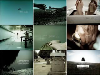
Okay, so I found myself watching 'Six feet under' a few weeks ago and I couldn't get over how much I liked the title sequences, if people know me then they will know that I LOVE title sequences I personally think they are better than the program or film.

I love the composition and the simplicity it has, not to forget the music, which was composed by 'Thomas Newman' fits perfectly with the scenes. I would defiantly want to try something like this one day.


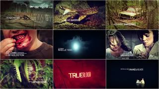
Then I saw another program that has recently started on FX called 'True Blood' and found out that it was the same Director/writer Alan Ball who did 'Six Feet Under', which didn't take much to figure out because they say that in the advertisements.


When I saw the title sequence for 'True Blood' I loved the strange quirkiness of it and the raw material used to make such a unique sequence. It sort of reminds me of the title sequence from the film 'Seven'.
I did a little research to find out who created these title sequences for 'SFU' and 'TB' and found out it was the same company 'Digital Kitchen'. Click the link to check it out yourself.

HELLO!

Once I find something interesting to post I will until then, this is the only thing you will see in this blog.